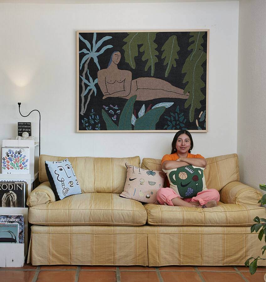
Can you tell us a little bit about who you are and what you do?
Hi! My name is Lilian Martinez. I go by Lil. I’m a visual artist. I use that title because it feels specific enough and at the same time broad enough to describe all the things included in my practice. I paint, draw, and design. I also run a small online shop called BFGF.
What is your current studio/workspace like?
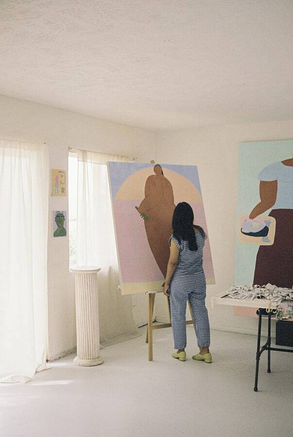
My studio is in a detached garage. It’s a few steps away from my home. There is a sliding glass door in the back and a frosted glass garage door.
The glass doors allow a lot of light to come in. There’s a small mud type room at the entrance with a bathroom that I use as a shipping/office area.
In your previous interview with Juxtapoz, you mentioned seeing similar trends in your practice to that of the Bauhaus. Can you talk about this and about the role of functionality in your art practice and BFGF?
The description at the start of the exhibition described the Bauhaus as an attempt to bridge the gap between art, craft, design, and architecture. It made me think that the ideas I was having were not new, but they were universal. Isamu Noguchi described something similar, “The Architecture of Living,” integrating art with home and functionality. I like art in the same way I like beautiful functional objects.
The women in your paintings joyously take up space. How important is the exploration of space in your practice?
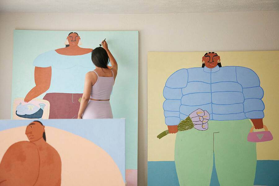
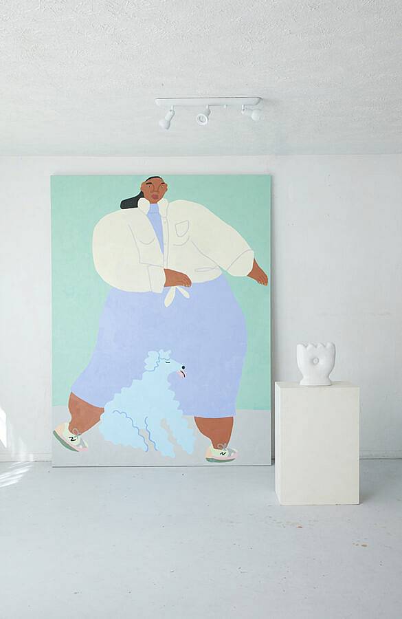
Through my practice, I’ve learned to create space for myself. I think a lot about occupying space that was not created for me or people that look like me. Also, I think spatial balance is really important for me when I’m creating an image. I want the figures that I draw to occupy the space comfortably.
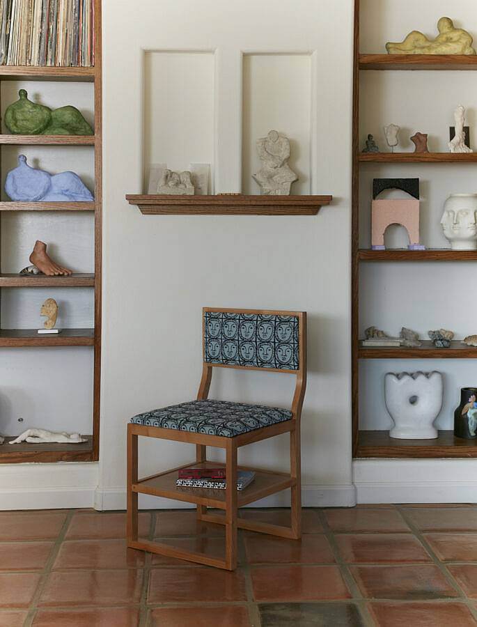
How do you feel your work’s representation of rest relates to or is significant to today’s current culture of hyper-productivity, especially amidst a global pandemic and national movement for racial equality?
I think rest and comfort are true luxuries that I wish everyone had access to. Having access to these luxuries as a non-white person can feel radical at times and can be an act of self-preservation.
Can you talk about the visual language you’ve constructed with your practice?
I use color, form, and cultural signifiers to make images that make sense to me visually. I feel fortunate that people have connected with my work. I see it as an emotional language where I can communicate without using words.
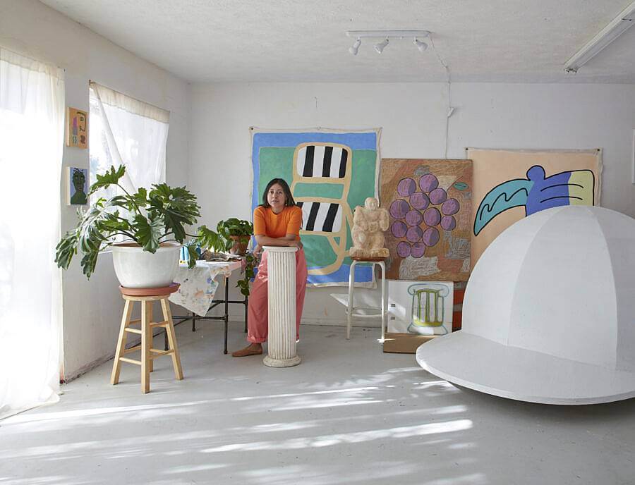
Your paintings pair classical architectural imagery with contemporary visual culture from your childhood–basketballs, Lisa Simpson, anthuriums, and ionic columns come to mind–can you elaborate on some of these symbols specifically?
The things that I draw from my childhood for me are not nostalgic because they are still relevant to me. But the way that they exist for me has shifted. I grew up in Chicago. The Chicago Bulls occupy a lot of my memories. The energy that created was an enigma to me as a child, but it felt very special. I would see it on tv and then I would see it in the streets. I still see basketball as a source of joy and excitement, but now I also see the ball as a beautiful, functional object. My work is a marriage of past, present, and an imagined future.
How has living in Los Angeles impacted your use of color?
The sun is really strong in Los Angeles. It gives colors a sun-washed look. I’m drawn to those colors in my work. I like to mix colors that are bold and strong, but have a softness to them. I just moved to Yucca Valley about a year ago. The sun is similar, but there are fewer color variations. It’s more desert than city.
What have you been reading about these days?
I have a lot of art-related books and during the start of the pandemic, I thought I would read a lot. I normally enjoy reading about art theory, design, and architecture. But I found that it wasn’t fun for me if I couldn’t apply it to my experiences. I couldn’t go out to a museum and reference what I had learned. That felt isolating. I had a reading block for a while. I realized that at this time what I most enjoy reading about is people’s experiences.
Recently I’ve read This Is What I Know About Art by Kimberly Drew, A Month in Siena by Hisham Matar, Black Skin, White Masks by Frantz Fanon, and The Beauty in Breaking by Michele Harper. Right now I’m reading Disability Visibility edited by Alice Wong.
Do you have any upcoming projects or shows?
I have an online exhibition launching on October 22nd at Taymour Grahne Projects
Interview composed by Amanda Roach.
