Tell us a bit about yourself and what Dinamo does?
Dinamo started around 2013 – maybe still in Amsterdam, possibly already in Berlin. Today we’re a flexible team of 6 to 12 people working part-time between Basel, Berlin, London, Offenbach, Melbourne, San Jose, Tallinn, and Lausanne on creating retail and bespoke typefaces, running the type foundry, developing design software, holding workshops, research, and consultancy.
How did your interest in art or design begin?
Johannes got into design because of Counterstrike gaming and running a clan website, Fabian through starting a school newspaper to get free tickets to concerts.
What artists and designers have you been collaborating with lately?
We’re privileged to work with a lot of artists and studios that we’ve followed and admired for a long time. Humans & Machines, Obby & Jappari, Golgatha, and bus.group were involved in creating our new website. We develop new typeface designs with Erkin Karamemet, Tanja Modrakovic, Renan Rosatti, Giliane Cachin, Wei Huang, Margot Leveque, Simon Mager, and Leonardo Azzolini. Maximage and BNAG.cc collaborate with us on furniture projects. Also, together with Elias Hanzer and Mike Nigra we are teaching workshops in Italy and Austria this month still.
Do you have any upcoming or recent projects?
At the moment we are working on a Corporate typeface for German suitcase company Rimowa, on a letter-based furniture system with our friends from BNAG.cc, on a cloud hosting solution for our new website, and a custom typeface for a not-yet-to-be-disclosed outdoor apparel company.
What are some of your favorite commercial collaborations you’ve worked on? Cultural collaborations?
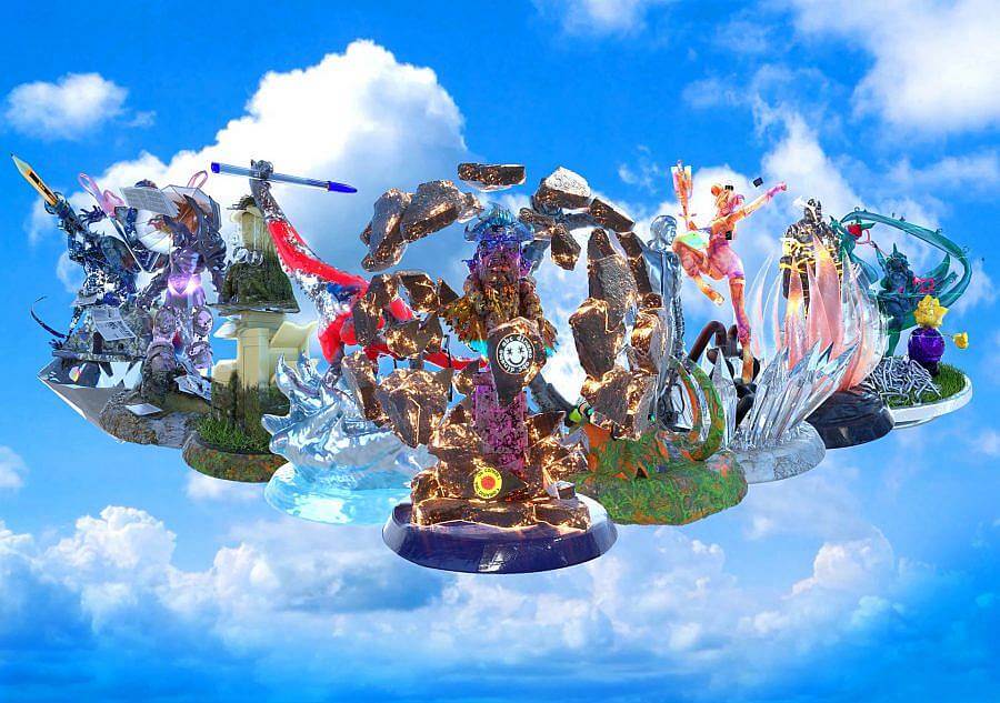
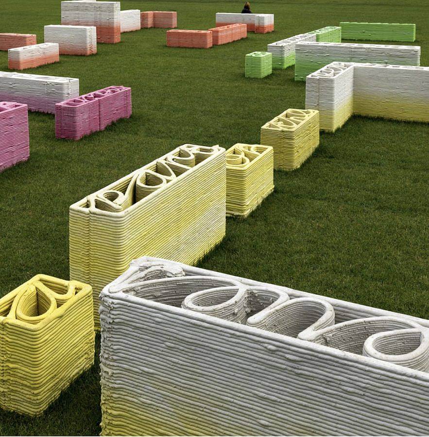
One of the most surprising collaborations we were involved in thus far, was a project we developed together with artist collective åyr for the Stedelijk Museum in Amsterdam. During the Holland Festival, the museum creates a public installation on the Museumsplein, the huge field in front of Amsterdam’s museum, which that year was based around the topic of affordable housing and today’s shortage of it in many cities around the world. At first, we wanted to build small houses on the field, but because it rains a lot in The Netherlands and heavy objects would sink into the wet field, we ended up laying out apartment floorplans in word-blocks, which were forming texts reflecting on the topic.
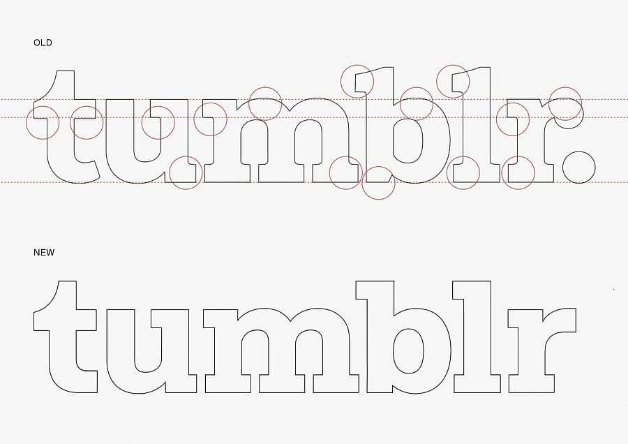
On the commercial side, a favorite project of ours was the development of a custom version of our Favorit typeface for Tumblr in 2017. Since a company of this size and kind has an internal design team, communication is quite succinct and you’re able to meet and discuss and develop ideas with the people that call the shots. This way, in conversation with Creative Director Doug Richard it was possible to develop a version of our Lining-Feature instead of an Italic, which not only allows for highlights can also function as links and handles in an intelligent and visually characteristic way. This was something rather unconventional and probably not that easy to make happen when you first have to pitch to a contracted outside agency that then is (hopefully) forwarding the idea (well) to the end client. :–)
Can you talk about the process of making bespoke typefaces?
The process varies depending on tasks, timeframe, or budgets of course. But if possible, we always first meet with a client to get to know one another and talk about the project more intimately. For instance, what does everybody have in mind exactly, why do they think they want something, previous experiences, troubles, dreams or fears, etc.
Sometimes it makes sense to do a workshop next, to develop possible concepts together, or to share insight on the technical possibilities or limitations. Other times we start with an immediate research phase and then pitch directions that we feel might develop further. Once a design idea that everybody likes is agreed upon, we extend and fine-tune it in dialogue with the client to a full-scale font.
In parallel and/or afterward, the necessary production steps are taken care of. This includes spacing and kerning so that the type sets smoothly. Sometimes a project requires smart features in OpenType and we also love creating variable axes that allow for more flexible design decisions later. At the end of production, mastering work has to be completed to guarantee font files work properly across platforms, devices, browsers, programs.
How does working across Basel, Berlin, and your extended satellites, impact your design studio?
In the beginning, it was a challenge to find good ways to work long distance on all the projects we wanted to work on together. Over time we found productive ways to ping pong ideas, test, and develop them in one or both places with the help of cloud spaces and project management tools before feedbacking and polishing an idea to its final form together. And of course, we try to meet as often as possible in real life as there are surely things that are done more easily, efficiently, and satisfying when you’re in the same place or together in front of a print-out or display.
Can you discuss your recent collaboration with Caroline Vang?
Bus.group have been friends of ours for a long time and we have always wanted to work with them on a project. So, when we started to develop content for our new website and saw the need for some kind of type-family-teasers we immediately knew that we did not want any of those fake wine labels but something different and original – which felt like a perfect opportunity to finally approach them. Together with Caroline and ATEQ they ok our typefaces to the labs and analyzed and documented their inner qualities visually and acoustically – an otherworldly experience!
In your relaunch, you discuss how it’s not just the two of you anymore, what has been it like expanding your design team and/or family?
Dinamo started because neither of us likes to work alone. In the beginning, it was just a spare time activity, but over time we were slowly able to do more work and involve more people in our projects. Today we’re still a small core team day-to-day, but in type design, it’s amazing how the best people out there are interested in conversation and collaborations and how many great friendships have grown from that for us!
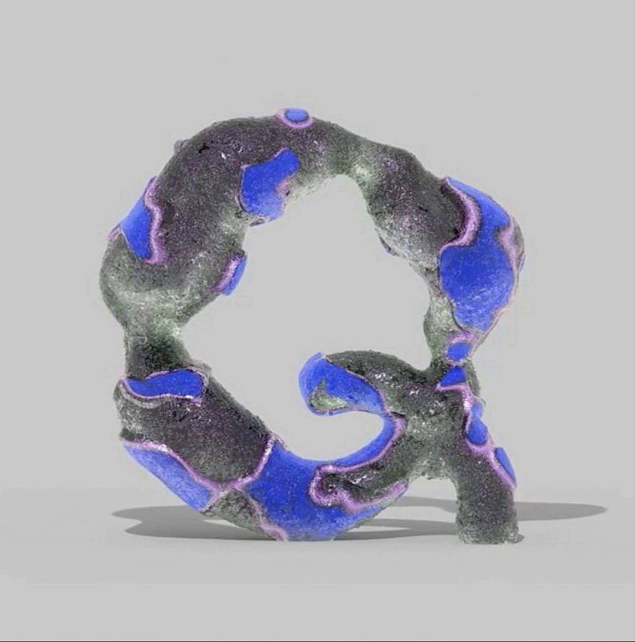
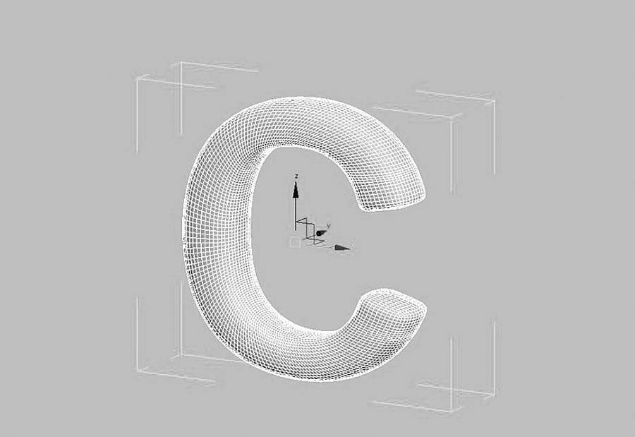
During your collaboration with Manuel Roßner of Hightype to create HT Standard you acknowledge that” typography is currently finding its feet in three-dimensions,” How are you addressing 3d design in your typefaces?
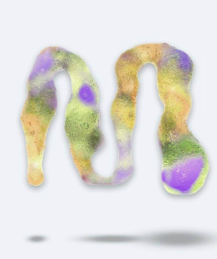
Unfortunately, today’s design software does not yet allow us to design 3d typefaces. For a font to function as a typeface, it has to be reduced to basic vector information and most effects or features can be added or applied to it afterward. Because of our friendship with Manuel, we knew about the amazing possibilities that arise when working with type in 3d – but we also knew that most typefaces present difficulties when importing and transforming them into software like Blender or Rhino. So, when we finished Monument Grotesk, together we had the idea to also prepare it properly for working in 3d and optimized a vector version with a carefully plotted equal distribution of polygons so that however you edit or embolden their forms, they’ll remain smooth and without any unwanted corners or glitches.
Can you discuss how you’ve changed how you price typefaces to a value-based system instead of a usage-based one?
With pleasure: At Dinamo, we believe that individuals, small companies, and institutions should not have to pay the same price for a typeface as large companies. Therefore, we’ve established a “value-based” pricing system as opposed to “usage-based” pricing. We reckon: The bigger the size and reach of a company, the bigger the commercial value being extracted from the typeface.
Following that understanding, we’ve based the price of a typeface on the company size of the License Owner, rather than on how many people within that company use the font files. Imagine a large car company where only a small number of employees work on computers, compared to a small cultural institution or non-governmental organization where a lot of the work is done with computers.
Why is making your typefaces accessible to the student population important?
Having been students ourselves not long ago, we remember how type-libraries of schools can be a little dusty and how students often want to use the same up-to-date tools in their school projects as the professionals use out there. But because student projects are mostly self-initiated and without clients and budgets, we feel that the pricing needs to reflect on that. Fonts should never be for free because there’s a lot of work and risk that goes into developing a typeface – but extrapolating the logic of the previous question, a student should also never pay the same price for a font as a professional.
What is one of the bigger challenges you and/or other designers are struggling with these days and how do you see it developing?
The previously described licensing is a reaction to a lot of headaches we had in the past and luckily we see our new way to go about it being well received and understood, both by designers and clients!
Another challenge is that with the increasing speed of today’s design world, we also have to protect our typefaces a bit more from not being used too much too quickly in too large projects. As an experiment, we recently started a section on our website called the “Beta Fonts”. There we offer new typefaces ahead of their official release already upon request and can therefore guide them more closely and personally on their way out into the world.
Other than that we’re currently reworking the way how to market VariableFonts – more about that mid 2021!
Interview composed by Amanda Roach.