Tell us a bit about yourself and what you do.
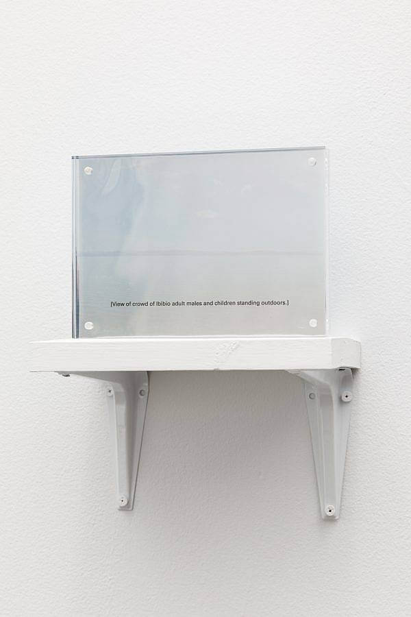
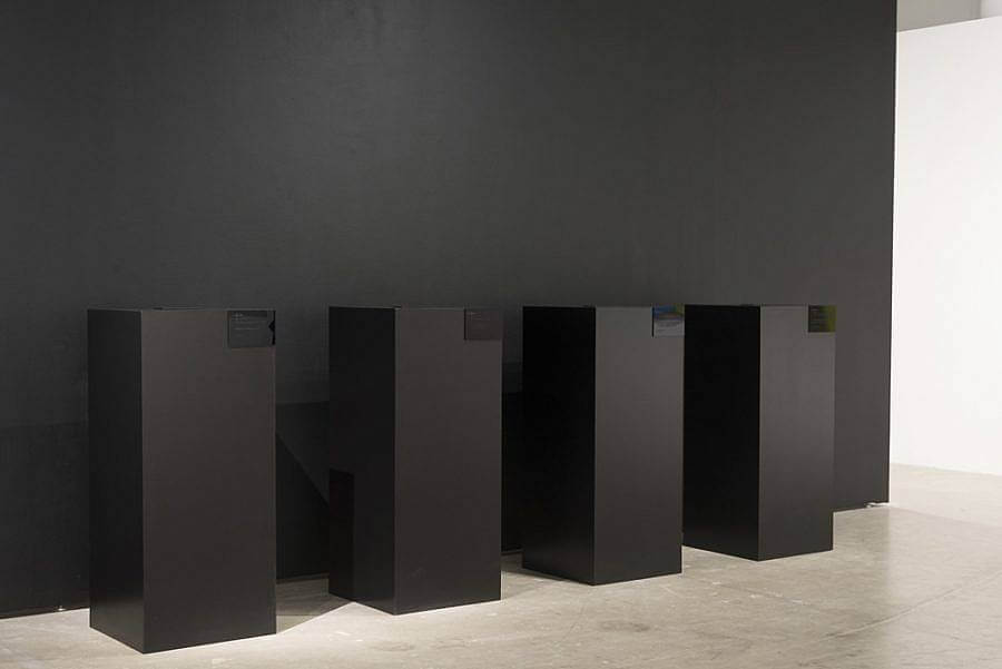
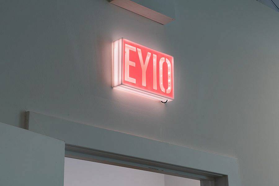
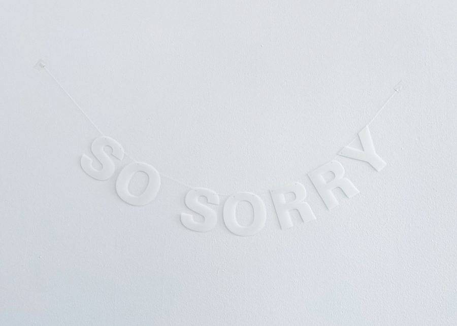
A lot of what I do is setting type. I make text-based artworks that take the form of everything from embroideries to letter garlands to computer games. I also appropriate and re-present archival and canonical images—I’m interested in the construction of history and beauty, particularly in the Western canon, and in examining how they function and how they fail. More recently, I’ve been making abstract installation and sculptural works, which deal more directly with an idea of the void that I’ve been exploring.
Alongside my own practice as an artist, I work as a graphic designer doing a lot of the same things—research, typesetting, making sure that images are the right resolution—for other artists and arts-adjacent organizations. Communication is important to me, and while much of my own artwork deals in complicating communication, it feels good to make sure that others are being heard as clearly as they want to be.
How did you get started as an artist?
In many ways, I’m still getting started! I sort of filtered through what seemed like more practical alternatives to being an artist, thinking first that I’d be an architect, and then, when I realized that I didn’t want to make practical buildings and enjoyed making the presentation boards more, that I’d be an art director. I moved to Chicago to do my MFA in Visual Communication Design, telling myself I’d get a job at an ad agency or something, but I admitted to myself pretty quickly that what I really wanted to do was use the tools and theory of my design education to make art.
What does it mean to incorporate text into your work?
Much of my work has communication as its subject matter, and text is just that: communication. I find the relationship between what a text says and how it looks and is presented—how these things combine to make meaning—fascinating. I find text, and typography in particular, formally compelling as well. Examining how form and content come together (or don’t) is a big part of my practice.
How do you mean to explore the void in your practice?
I mean nothing. I mean to say: there is nothing. There is nothing.
What inspired you to found Plates Journal, and what has been your experience of putting out its various iterations?
While I was in grad school, my good friend Casey Carsel, who’s an artist and arts writer/editor, and I worked together on F Newsmagazine, the School of the Art Institute of Chicago’s student paper. We enjoyed both working together and working on an arts publication, and so we decided to try to keep it up after graduation. We named it Plates after the ‘plates’ section of images one finds at the back of older art history books, and because we both love to cook. I designed the print format based on the content we had in our first issue, and so each issue is an exercise in reworking that template in subtle ways so that it and the varied material we get from our contributors fit together organically. Plates is print-first, so it’s also an exercise in translating that print edition to the web.
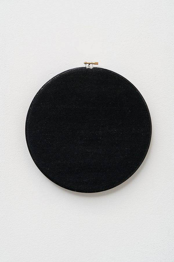
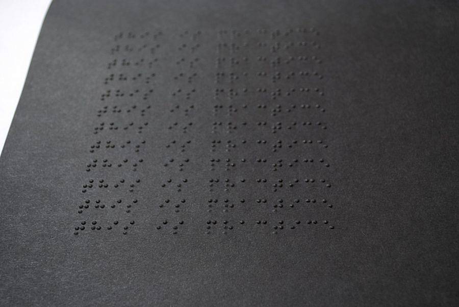
Can you talk about the material and conceptual use of black pigment in your work?
My use of the color black is intertwined with this idea of the void. As black is often used to redact information, it’s an absence that is very visible. “Black” as an adjective is incredibly loaded, whether it’s describing magic, a mood, or people. I think a lot about the cultural and etymological intersections between words that come from the Latin root word “neg,” like “negate,” which means “to deny,” and the ones that come from “niger,” like “denigrate,” which literally means “to blacken.” When I use the color black, I want to deny (access, the gaze, etc.) as I blacken, and I want to call attention to my doing so.
What are you reading right now?
I’m reading Jean-Paul Sartre’s play Les Mouches, which is a retelling of the Electra story. My partner and I are also working our way through Terry Pratchett’s Discworld books, reading aloud. If you haven’t had anyone read aloud to you outside of childhood or church, I highly recommend it, though it does mean you move through books pretty slowly.
What does it mean to represent alienation?
I try less to represent alienation than to have viewers experience that alienation themselves. I do this by incorporating some layer of obliqueness or obfuscation to the work, in form, content, or both. It can be an image out of context or a self-referential text; or a material finish that’s highly reflective or very low-contrast.
I found myself ruminating on the games page of your website. How do your anxiety stimulators and interactive games play a role in your artistic process?
The anxiety simulators are another facet of my quest to induce feelings of alienation in others. I made my first one, grocery shopping, when I was in undergrad and having an unreasonable amount of difficulty making it through the grocery store in a reasonable amount of time, even though I always bought the same things. By distilling the experience into a minimal, textual form, I was able to work through my own anxiety, understanding its mechanics so that I could reproduce them as a game. Most of the works that I call “anxiety simulators” come from the same kind of source: my facing something that’s troubling me, be it applying to grad school, quarantine, or watching a plant die, and then trying to simulate it. I don’t actually recommend that anyone play them, but people still do. On the other hand, my other interactive text works like portrait of my brother are more part of my continued exploration of text and its modes of presentation.
Any upcoming projects?
I’m showing new work in RAISIN, which is a group show with 6018North and the 2021 edition of the Chicago Architecture Biennial. I also have a solo show opening at Tiger Strikes Asteroid here in Chicago; both shows open in early September. And Plates Issue 04: Craft will be out late summer/early fall.
Interview composed by Joan Roach. Edited By Sam Dybeck & Joan Roach.