Can you tell us a little bit about who you are and what you do?
I’m a graphic designer and art director from Toronto, now living in Brooklyn. I work freelance, as well, and I have been the designer for Canadian art magazine C Magazine for the past 6 years now. I also write sometimes.
How did your interest in art and design begin?
I had a cobbled-together PC in grade school with a stolen copy of Adobe Suite and Macromedia, so I spent time playing mostly in Photoshop and Flash. Then in high school, I got into making posters, merch, artworks for friend’s bands. I went to design school thinking of working in fashion magazines and it wasn’t until late into undergrad did I get a concept of design as a field for research, art, publishing, theory, or anything other magazines and branding.
What process did you go through to found exo Publications?
exo Publications represents my desire to get back into the idea of publishing and design that I fell in love with back at OCADU. Working in NYC the last few years hopping from studio to studio, you know, doing whatever work is there to get by, and I wanted to have a place to refocus. I’d been meaning to do a proper publishing of my thesis, but it took me some time to get into the headspace to clean it up, add to it, and have the money to print. I self-published it under “exo Publications” with the aim of it being a proof-of-concept for a publishing project.
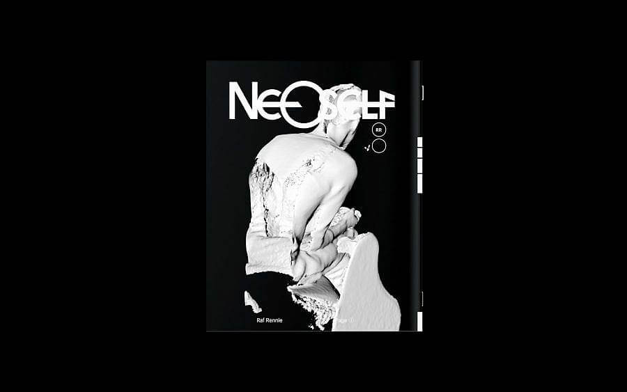
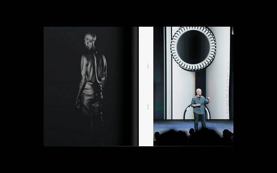
Introduce us to your NeoSelf project. How does the project examine the technologies of digitization and reproduction concerning our everyday lives?
NeoSelf was the first project I started in my master’s and was a continuation of the research I was doing beforehand, which is the idea of how we augment ourselves, our behaviors and identities, to better populate online. The first issue of NeoSelf came just as the Apple Watch was announced with its feature to record your heartbeat and play it on someone else’s watch as haptic feedback. It captured the desire to feel connected and the vulnerability that actually goes along with living and sharing ourselves digitally. It’s not just ego, there’s a sense of loneliness and a compulsion to it also. Each issue was a project of me documenting myself as completely as I could, my physical appearance, all my data, my genome, trying to create a series of tools that could be used to create reproductions of myself so I could proliferate and exist beyond my own body.
What has been your favorite issue of C Magazine that you’ve worked on? What was the design process like for that particular issue?
One of the latest issues really would be my favorite. These issues are from my redesign of the issue and I think, with a lot of things, it’s not perfect right away at launch, you need to settle into it and get used to your own systems. The process is pretty open for all of them, we’re a small team so I get all the content from the editor and have 2 weeks to design it all. The editor and I go back and forth for multiple rounds making edits until we’re good to go, but those are mostly text edits, I really have a lot of trust and freedom design-wise.
What designers, writers, or artists have influenced your design practice?
General Idea, Metahaven, Helmut Schmid, Satoshi Kon, Peter Saville, Theseus Chan, Bernadette Corporation, Linda van Deursen, Sheila Levrant de Bretteville, Franco “Bifo” Berardi, Paul Virilio, Anton Vidokle, Barbara Stauffacher Solomon, Mamoru Oshi, Andrei Tarkovsky, Jenny Holzer, Trevor Paglen, Rei Kawakubo, Rick Owens, Jop von Bennekom.
How does your work investigate design as a “vessel for dissemination” and semiotics?
When I applied for my master’s I said I viewed design as a vessel for dissemination, but I was unsure of design’s place in culture and discourse, I’m still not fully sure. I don’t believe design can intentionally insert icons, signs, and ideas into a discourse or the zeitgeist, but that it happens most often accidentally. Design works best as a force upon messages and ideas as opposed to just a channel to deliver them—trying to layer, juxtapose, push them to points at which they break, trying to expose the channels and systems that they operate on. Less cryptically, design works mostly as a messenger of capitalism, and I don’t know how you set out to make a design that isn’t capitalist, you’re stuck in it, Debord and Fisher stuff. Design must consider it’s position in the channels of capitalism and whether it can act parasitically upon itself to produce something intersectional that defies the order capitalism constructs. It’s something I think about, but to be honest, I haven’t found for myself, as the burdens and market of capitalism still demand participation and parsing that seems like something that happens reactionarily. It’s more an ontological construct to help guide your reactions.
In terms of truth and access, what responsibilities do you feel independent publishers & designers have amidst today’s current art market?
I think publishing acts as an act of curation. It’s important for publishers to explore the things that interest them and just produce work from it, about it, and with tons of people doing that, you create these constellations of all kinds of ideas and discussions to exist. A quote I came across in undergrad was from Walter Benjamin, “I can say that for me the few journals and small newspapers in which my work appears to represent the anarchic structure of a private publishing house.” These constellations perhaps provide respites and alternatives for engaging with writing, ideas and work not curated by the larger art market and institutions, a little anarchy.
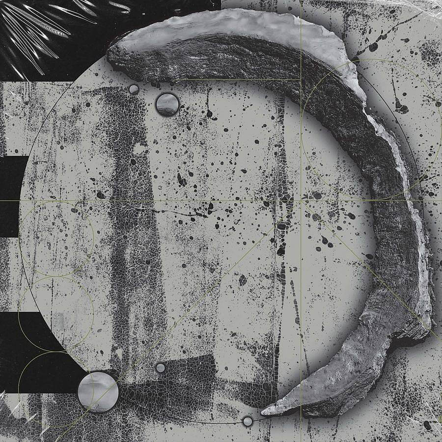
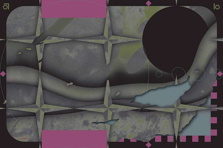
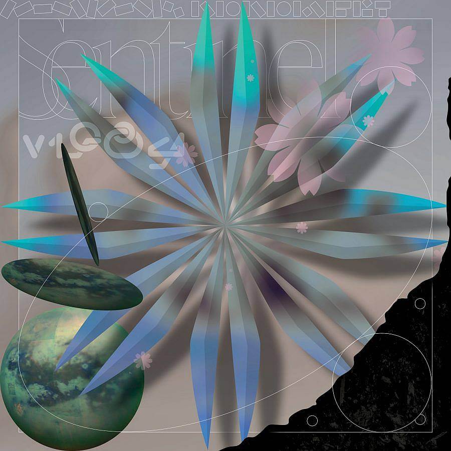
Across your body of work, you incorporate images of galactic schematics, seriated shapes, and marbled organic forms. How would you describe your “style” or the visual language that you’ve built?
I started by adding flat textures on top of works in a series of posters I did, I liked the tactility of physical texture and grit in digital work. I was really into the idea of skeuomorphism and wrote a bit on it. I saw it as being done two ways, through the grit and texture I took from surfaces in the physical world, and then these Apple Keynote type renders of their products that are a seemingly unreal, hyper-detailed, and flawless version of the real. I started combining them and playing with layers, I love having things that look 3D that have some flat graphic on top, and having the foreground and background mix, to create these things that kinda throw off how we see the thing, something that mimics the real but can only exist digitally.
Do you illustrate or source the texture’s you incorporate into your illustrations and artwork? Can you describe this process?
I have a folder of interesting textures, but I tend to source texture for each work because I always want them to mimic something, like the project I’m working on now. I wanted to mimic engravings and stone sculptures, so I found this nice free-to-use photo of a tarnished concrete wall. I up the saturations until you get these swells of color, and then blur it all so that’s the “light” side of the sculptures, it sort of looks like a super shiny metal with color highlights. Then I darken the original photo to create a dark shadow side of them that looks porous and rough.
You work as an artist and designer. Often those two words are used interchangeably. Moving forward, what role do you feel graphic designers fulfill in the state of media today?
Designers have always had this mythos of the ‘celebrity designer.’ It comes with building a practice and really responding to the market. You need attention and people to know who you are, so AIGA conferences, design documentaries, and kind all worked to elevate the role of the designer. There was an adverse effect where it created gatekeepers of the design field and that has been harmful to the growth of younger designers. It’s created a field where you have these titans and you go work for them, even when they historically don’t pay interns or overwork their employees because that’s the path into design. Social media has worked to help designers work around that by building their own mythos and “brand” on social media. However, you have a lot of people trying to differentiate themselves from each other so they become content-creators with curated IG Stories, and design tip slideshows, or they create their own merch, and now building your brand becomes as important as the work you put out. This shows to companies your savviness in building a brand and designing for specific platforms, IG, TikTok, whichever or app comes up. It’s another response to the market that demands designers and young creatives work more for free and make themselves more exposed and more available, all in a very similar way that these company-studios exploit their interns and juniors and it has come to feel just as inevitable.
What are you reading lately?
Flame Wars by Mark Derby, a selection of translated poems from Fleurs du Mal by Charles Baudelaire, Black Quantum Futurism by Rasheedah Phillip, Art Without Death: Conversations on Russian Cosmism out from e-flux, and been reading the Bungo Stray Dogs manga also.
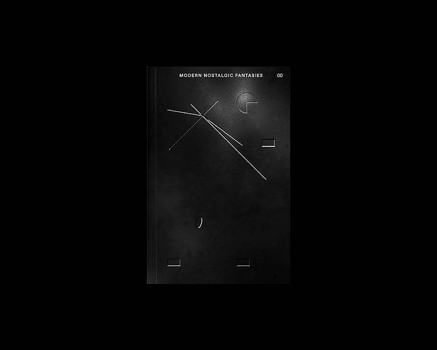
Can you talk about Modern Nostalgic Fantasies, your MFA Thesis, and its recent 2020 reprint?
Over my two years of doing my master’s, I would start every project by writing about the ideas I wanted to explore. We were free to take courses in any program within Yale so I took some liberal arts courses that interested me and I had to do writing for. I started the program having this desire to research and explore the relationships between virtuality, how people connect and commune online, and also how those things change how we understand our own identities. I took every prompt/workshop and seminar to try to point my work and writing towards that but writing from a disconnected series of starting points the texts, couldn’t really be presented as anything but a loose compilation. At the end of the program, you have to produce a catalogue raisonne that needs to talk about your design work directly and shows it as well, so I put all the texts together with a few pages of collaged images of my work in the back, I always figured I wanted to produce a copy without that requirement, one of just text.
The recent 2020 release is just that, the texts from the original, some edited further since I had more time on it, and some texts from before I started the program as a precursor—they read more like a diary and are there to preface why these ideas of identity are important to me but also help set this book as not purely academic writing but rather as a compilation of different writing styles, diaries, poems, essays. Modern Nostalgic Fantasies is still a creative work more than a truly academic one I feel.
Do you have any upcoming projects or shows?
Working on some client work, working on one project at the moment which should be out soon but can’t say too much. It’s given me a chance to keep exploring my style of artwork and explore it in different mediums which is exciting and getting to work with some great people on it. Besides that hopefully getting into the mind-space to finish up some things to come through exo, a short story I’ve been working on, some editions of public domain books, hopefully working with some artists.
Interview composed and edited by Amanda Roach.