Tell us a little bit about yourself and what you do.
I grew up in Munich. In 2002 I moved to Zurich for my graphic design studies and have worked as a graphic and type designer since then.
Type design can seem pretty nuanced to someone who’s not trained to notice it. What are the basics to a well designed typeface?
Besides the obvious aspects like proportions, well drawn shapes etc., to me the most important criteria is formal consistency and a powerful appearance at the same time. I think there needs to be formal consistency in every single glyph to make a typeface work as a whole. But within a conceptual and formal setting, you have to push it to the limit in order to keep it vivid. A lot of typefaces lack either one or another. Also for me, the design has to succeed in every type size. I try to avoid optical designs which are optimized for big or small type sizes (which i think is a very outdated but trendy approach).
Furthermore, what can a font communicate to a viewer that the text itself may not be able to?
I think to some degree a typeface can establish a particular mood or character for something, but this a bit of a cliché and certainly not true for more subtle designs. The usage is crucial and in an ideal situation it can blend with the typeface to become a whole. It certainly can communicate contemporariness, but even a 100 year old typeface can establish graphic design work with a contemporary feel. On the other hand, a newly designed typeface can feel outdated after few years. Often a typeface is referred to as a tool. But it is not a tool, it is design and identity in itself. A certain usage of a typeface can change the perception of the design and evoke associations which were not inherent from the beginning – which is not always for the better of the typeface when it comes to large-scale companies and media using it.
What’s your favorite project you’ve ever worked on?
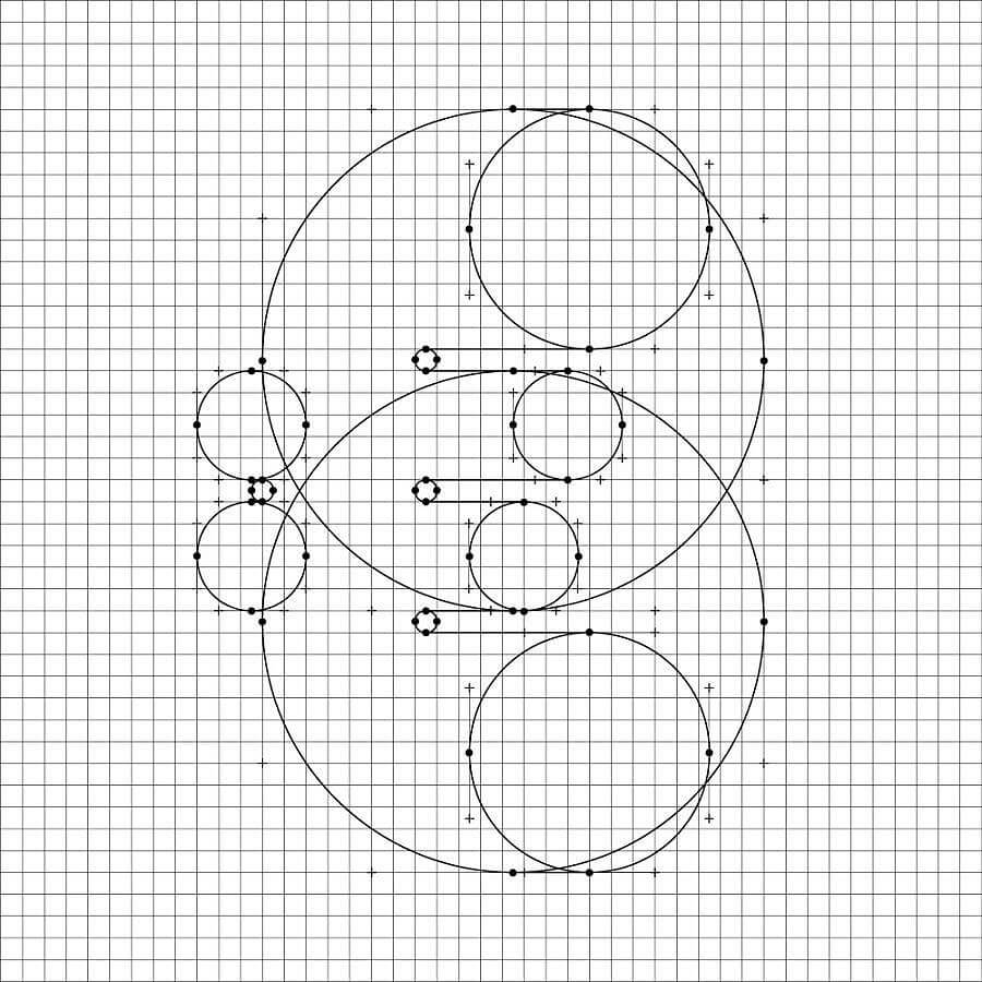
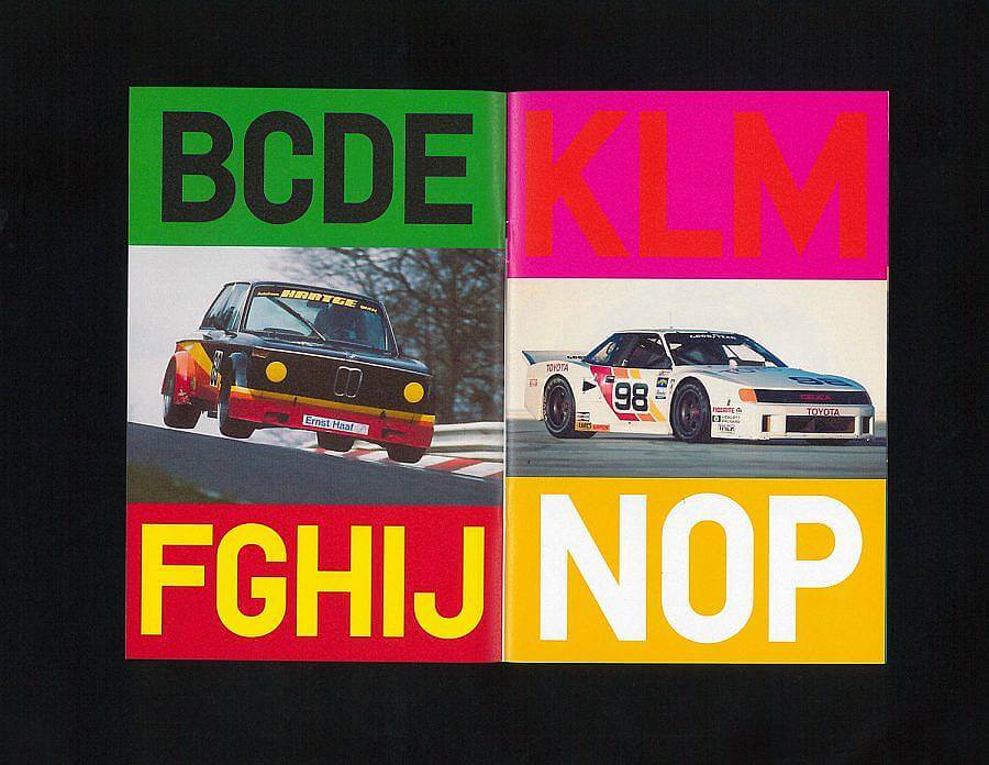
I have several projects which are my favorites for different reasons. Crack and SoLow are typefaces which are based on painfully restricted design concepts and in both projects I was on the verge of abandoning them. Especially Crack, which is one of my very first typefaces that taught me the importance of achieving diversity in glyph shapes despite its rigid circular grid. Within the SoLow typefaces, the italic version took a lot of energy to make it work. In the end it was really satisfying. Quick Marker is another self initiated type project which was really important to me. The manual approach — all glyphs were sketched with a broad marker pen — and the big shift when translating the sketches into digital drawings were really enlightening to me.
When doing custom work for a client, how do you translate their needs into a design that feels authentic to you as the designer?
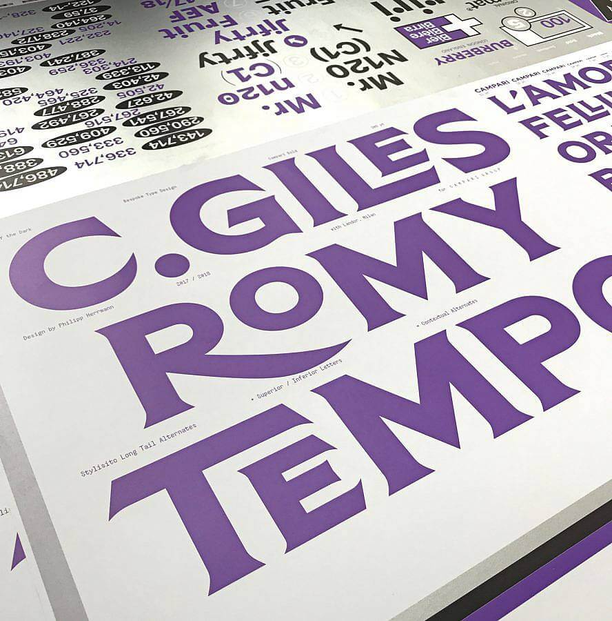
A custom type project mostly comes with given parameters (usage, technical application, corporate design concept, heritage etc.) which makes the starting point easy compared to my self initiated retail typefaces. Within these parameters I try to establish a formal consistency and create an appropriate and powerful appearance. I try to translate requested “gimmicks” into useful no-nonsense typographic features. The fact that type design has it own laws and cannot be burdened with that much concept like the rebranding itself is very liberating for my design process. In the end, a typeface is a system of several hundred glyphs which have to intertwine. I am interested in exploring the design within this system. I am not willing to break that for the sake of the branding because it will always fail in my opinion.
Who would you love to collaborate with?
I would really like to collaborate on soccer jerseys. It seems to be a highly complex process, and so far every agency and type designer (if there were any involved) has gotten it wrong. It’s puzzling to me, why the jersey outfitter industry hasn’t realized the potential of type design. They’ve been choosing a one-size-fits-all approach and with very few exceptions, the type is designed by amateurs.
Can you share one of the best or worst reactions you have gotten as a result of your work?
I started designing typefaces even though I was working as a graphic designer. My type design skills are mainly autodidactic. I did not have — besides a short internship at Dalton Maag — a type design education. From the beginning I wanted to learn and be in control of the whole process, from drawing to kerning and font mastering. When I started selling my fonts, the mastering was an issue. Clients sometimes complained about technical difficulties — especially within Windows environments (of course). So I had to figure things out by going through manuals of epic proportions and forums to solve the problem. The bigger the client, the bigger my nightmares. Thanks to a much more inclusive approach of software these times are over. Especially the “Glyphs Application” and their great technical resources- open to everyone- helped to democratize the mastering process.
The way Out of the Dark sells a viewer a font is really unique. Can you talk about the design of your website and the choice to tell the story of each font?
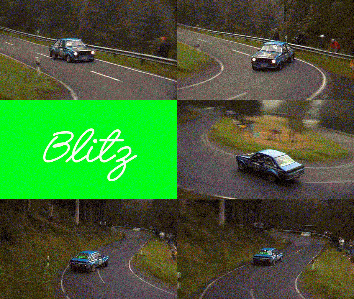
The main idea behind the outofthedark.xyz website is to treat each typeface equally by being used for the menu and navigation when activated. I want to avoid didactic or purely historical background information. Instead, for each typeface i try to create an individual aura. There is so much visually interesting material I come across when researching and designing a typeface, that I do not want to hide this when releasing the finished design. This may include material from the process itself, but also anything which is related to the name choice or the specimen texts is equally important.
Who are some artists or designers that you look up to?
Hammer (https://hammer.to), Radim Pesko (https://radimpesko.com), Lawrence Weiner, Wolfgang Tillmans, Olafur Eliasson
